Creating a peaceful and inviting home begins with the colors you choose for your walls, furniture, and accessories. Calm colors have the power to transform any space into a relaxing retreat, helping you unwind and feel at ease. But with so many hues available, how do you select the right shades for your home? This post offers practical tips for choosing calm colors that suit your style and enhance your living spaces.
Why Choose Calm Colors?
Calm colors are typically soft, muted, and understated shades that promote relaxation and reduce stress. Unlike bold or vibrant colors that can energize or overwhelm, calm tones create a balanced and harmonious environment. They help in:
– Reducing anxiety and improving mood
– Making spaces feel larger and more open
– Complementing a variety of decorating styles
– Providing a timeless, versatile backdrop
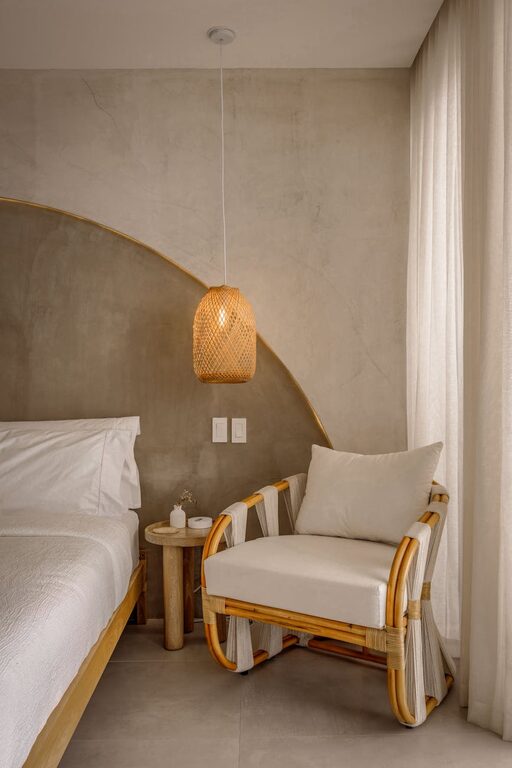
Common calm colors include soft blues, gentle greens, delicate grays, warm beiges, and light pastels.
1. Understand the Mood You Want to Create
Before picking colors, consider the atmosphere you desire in each room. Different calm colors can evoke different feelings:
– Blue: Often associated with tranquility and peace, perfect for bedrooms and bathrooms.
– Green: Symbolizes nature and renewal, ideal for living rooms and kitchens.
– Gray: A neutral choice that offers sophistication and calmness, great for any room.
– Beige and Taupe: Warm neutrals that provide comfort and coziness.
– Pastel shades: Light pinks, lavenders, and soft yellows can add gentle warmth and charm.
Understanding your mood goals helps narrow down your color options to those best suited for your space.
2. Test Colors in Different Lighting
Colors look different depending on natural and artificial lighting. To ensure your chosen calm color works well:
– Paint test swatches on your walls in various spots.
– Observe them at different times during the day (morning, afternoon, evening).
– Check how they interact with your room’s light fixtures.
Natural light can make colors appear brighter and warmer, while artificial light may cool them down or change their tone.
3. Consider the Room’s Purpose
Some calm colors work better in specific rooms according to their function:
– Bedrooms: Soft blues and greens encourage restfulness.
– Living rooms: Warm neutrals or muted earth tones promote conversation and comfort.
– Kitchens: Light greens or soft yellows add freshness without overwhelming.
– Bathrooms: Crisp light blues and greens create a clean, spa-like feel.
Choosing colors that support the room’s intended use enhances both aesthetics and comfort.
4. Use the 60-30-10 Rule
To create balanced and visually appealing color schemes, try the 60-30-10 rule:
– 60% – The dominant color (usually a calm wall color).
– 30% – A secondary color, such as upholstery or curtains, that introduces subtle contrast.
– 10% – An accent color used sparingly in accessories or décor items to add interest.
This method helps you layer calm colors without making your space feel flat or monotonous.
5. Pair Calm Colors with Natural Elements
Natural elements enhance the calming effect of soothing colors. Consider:
– Wooden furniture or flooring with warm undertones.
– Houseplants that add vibrant greens and fresh air.
– Natural fabrics like linen or cotton for curtains and cushions.
– Stones, ceramics, or woven baskets for texture.
These touches create connections to nature, supporting the sense of calm.
6. Avoid Overly Dark or Flat Hues
While calm colors are typically soft, be cautious with overly dark shades, which can make a room feel closed in or gloomy. Similarly, flat colors with no variation can appear dull. Instead, opt for:
– Light-to-medium tones with subtle depth.
– Colors with warm or cool undertones that complement your lighting.
– Finishes such as eggshell or satin, which reflect some light without being glossy.
This balance keeps your spaces feeling open, comfortable, and layered.
7. Think Beyond Walls
Calm colors don’t have to be confined to walls. You can introduce peaceful hues through:
– Furniture upholstery or slipcovers
– Rugs and curtains
– Artwork and decorative pillows
– Lamps and lighting fixtures
Incorporating calm colors in multiple ways allows you to adjust the vibe without committing to a full repaint.
8. Don’t Forget the Ceiling and Trim
Painting ceilings and trim in calm colors (or coordinating neutrals) ties the entire room together smoothly. A lightly tinted ceiling color can add warmth and interest, while trim in crisp white or soft gray keeps the look fresh and clean.
9. Test Your Favorite Combinations
If you’re torn between a few calm colors, try creating mood boards or color samples together. Compare how they look with your furniture and decor. Most paint brands offer small sample pots so you can paint patches before deciding.
Conclusion
Choosing calm colors for your home is a wonderful way to create spaces where you can relax and recharge. By understanding the mood you want, testing colors in your lighting, considering each room’s purpose, and using thoughtful color schemes, you can craft a harmonious and soothing environment. Remember to incorporate natural elements and explore colors beyond just your walls for a well-rounded look. With these tips, your home will become a peaceful haven you’ll love coming back to every day. Happy decorating!